Client build · 2026
Figs & Honey
A compromised WordPress site replaced with a ten-route Next.js build wiring four third-party systems together, delivered across a six-week engagement with a lot of moving scope.
- Role
- Design, build, integrations, DNS cutover
- Timeline
- 6 weeks · signed June 25, live August 8
- Stack
- Next.js 16 · React 19 · TypeScript · Tailwind 4 · Keystatic · Square · Mailchimp · Turnstile

Figs & Honey is a Salt Spring Island spa run by a practitioner with twenty-five years in the field, plus a winter studio in Victoria. It's the largest build I've delivered, and the one that taught me the most about running an engagement rather than just writing code.
Replace, don't remediate
The existing site was a dated WordPress install, and a friend of the owner who audits systems had found something worse: it was compromised, quietly injecting spam links into the contact page.
Cleaning a hacked WordPress install means removing what you can find, patching, and then hoping. You inherit the plugin surface, the unknown backdoor, and the responsibility. I chose to replace the platform outright: a fresh statically-rendered Next.js build has no plugin surface for the old problems to crawl back through, and the compromise couldn't follow it.

Replacing cost more up front than a cleanup would have. I still think it was the right call. The alternative was promising to keep a hacked system clean when I couldn't see all of it.
Four systems, none of them mine
The hard part wasn't the pages, it was the integrations. A one-person spa needs booking, payments, a mailing list, and spam protection, and none of those should be things I build or hold.
- 01BookingSquare Appointments, embedded, reserve-only — one calendar behind every treatment so double-booking is structurally impossible rather than merely unlikely
- 02Paymentseach shop product carries a Square payment link, so checkout happens on Square's hosted page and no card data ever touches the site
- 03ContentKeystatic, a git-based CMS — the journal and every shop item are entries the owner edits herself
- 04Mailing listMailchimp embed, because she already used it and switching tools is a cost with no benefit
- 05FormsFormspree with a honeypot and Cloudflare Turnstile verified server-side, on a site whose previous life involved injected spam
The rule I stuck to: the site handles how things look, the specialists carry the risk. Product descriptions and photography live in the CMS where they're part of the design; only the checkout hands off to Square. That keeps PCI scope at zero, and it means a payment provider change is a link swap rather than a rebuild.

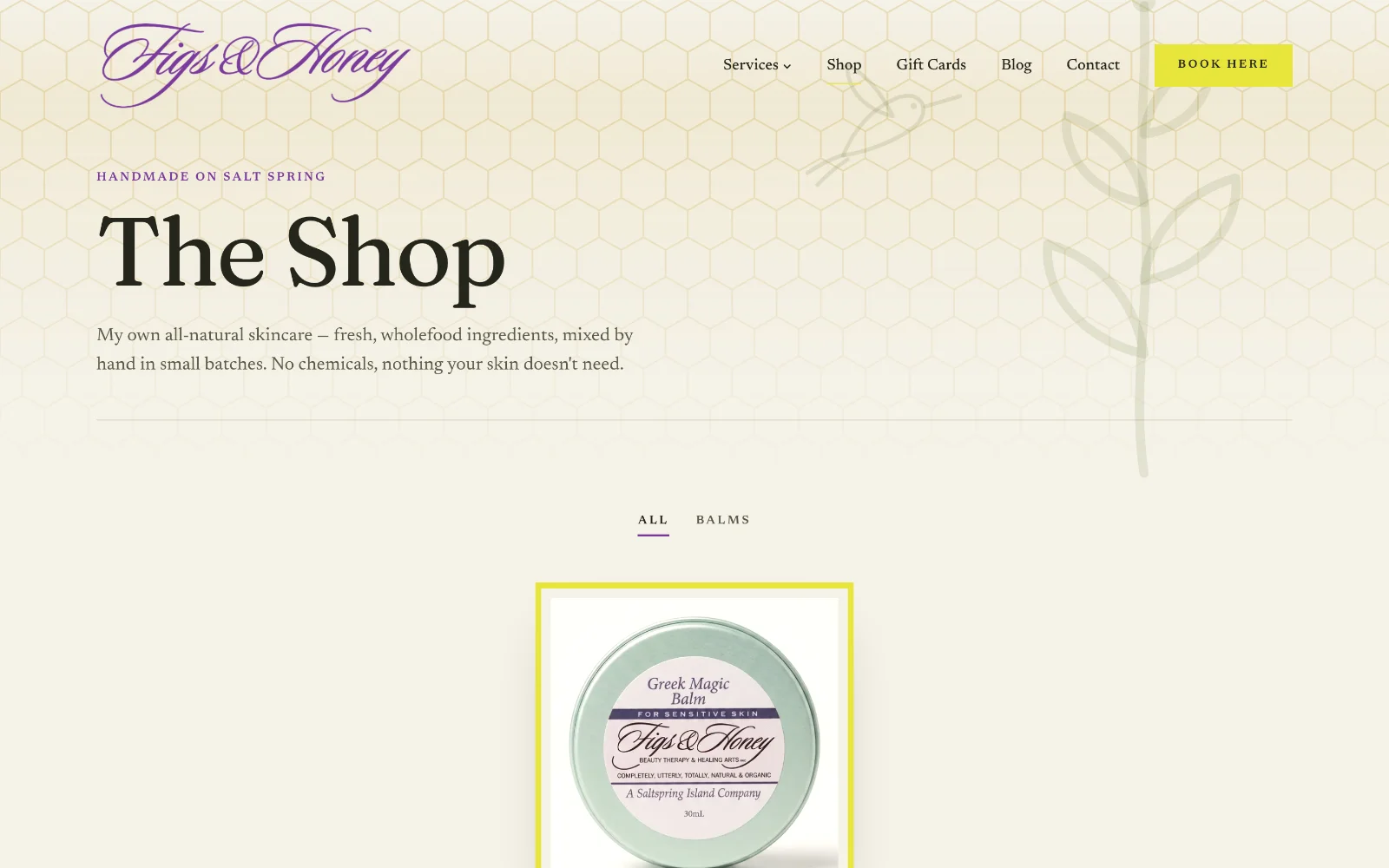
The shop is the same shape. Adding a product is a CMS entry with a photo, description, price and a checkout link, so she stocks her own shelves without a developer in the loop.
Two bugs worth writing down
A logo that looked clipped, and wasn't. The wordmark rendered with its edges shaved. The obvious suspect was CSS clipping in the nav, and the obvious fix would have been padding until it looked fine. Measuring the source file instead showed the ink ran off all four edges of the artwork itself, 26px on the left, 16px at the bottom, with the flourish ending in a flat cut. Nothing in my code was wrong. The asset was. I asked for a clean export, cropped it to the artwork plus 4% breathing room, and produced two recolours for light and dark grounds. Padding would have shipped a permanently lopsided logo and hidden the real cause.
A layout bug that wasn't where it looked. Body copy in one section appeared "inconsistently cut off". It was measurable rather than a matter of taste: within the same column, the label, heading and buttons ran at 697px while the body and credentials ran at 448px, so the paragraph stopped 250px short of everything around it. The same root cause turned up in the header: max-width and horizontal padding on the same element, so border-box sizing ate the padding out of the content width and left the logo sitting 24px inboard of every section below it. Moving padding to a wrapper fixed the alignment sitewide. When I widened the body I checked the cost rather than just closing the gap: lines land at 60–71 characters, comfortably inside the readable range.
Managing scope, which was the actual hard part
Six weeks, and the brief moved throughout: a shop appeared mid-build, pages were renamed, the entire contact strategy changed when she told me she could no longer take phone calls, which meant sweeping about ten places across the site where a phone number or a "call" was implied.
Two things kept that from becoming chaos.
Build once, use everywhere. When gift certificates needed to appear on both the home page and the shop, I extracted a single component rather than copying the block. Two copies drift apart, one copy can't. That sounds obvious until you're on revision nine and the copy in one place is a month behind the other.
Route enquiries to one place. Contact buttons originally named channels, and some fired the visitor's mail client, where a message can silently die. Everything now goes to a form that routes by reason. The deliberate exception is booking, which still goes straight to Square, because booking and enquiring are different intents and collapsing them would cost her appointments.
The site went live August 8, on a ten-route build she runs herself.
What I'd do differently
I made go-live conditional on the client being "100% happy". That sounds generous. It's a mistake: nobody can define it, so the job has no real end and the last 10% can stretch forever. Every job since uses an objective trigger instead: an agreed scope, a fixed revision count, and completion measured against the brief rather than a feeling. The work is just as good. It just has a finish line both sides agreed to.
"Owen was brilliant. He held my hand and was incredibly patient and helpful. He built two wonderful websites for me with a shop on and booking system too."
— Lisa Sliwowska, Figs & Honey